
"Overall satisfaction is 3.8 out of 5" is one of the least useful sentences in business, and it shows up in more reports than it should. It's not wrong, exactly - it's just an average, and averages have a specific, well-known flaw: they can look perfectly stable while something underneath them is genuinely falling apart. A number that's holding steady overall can be hiding one group of respondents who are increasingly happy and another group who are quietly heading for the exit, with the two effects canceling each other out in the topline figure. Cross-tabulation - breaking one question's answers down by another question, or by who answered - is how you actually see that. It's where most of the real insight in a survey lives, and it's also where the most common, easiest-to-make mistakes in survey analysis happen.
Table of Contents
- What Cross-Tabulation Actually Is
- Why the Overall Number Can Lie to You
- What's Actually Worth Breaking Down
- When a Segment Is Too Small to Trust
- How Cross-Tabs Usually Get Built
- Common Cross-Tab Mistakes
- FAQ
What Cross-Tabulation Actually Is
At its simplest, cross-tabulation is just splitting an answer up by a second variable and comparing the pieces. "38% of respondents rated us 4 or 5" is a plain result. "42% of Enterprise customers rated us 4 or 5, versus 29% of small-business customers" is the same underlying data, broken down by customer type - and it's immediately more useful, because now you know where the strength or weakness in that number actually lives, not just that it exists somewhere in the dataset.
You can cross-tab against almost anything you collected: a demographic field, a plan tier, how long someone's been a customer, how they answered an earlier question, even a hidden tracking field capturing which campaign brought them to the survey in the first place. The mechanics are the same regardless of what you're splitting by - what changes is which breakdown is actually worth looking at, which is really the whole skill involved.
The Overall Number
- One aggregate figure, blending every segment together
- Can hide two groups pulling in opposite directions
- Looks stable while something real is actually shifting underneath
A Cross-Tab
- The same question, broken down by a real segment
- Reveals which group is actually driving the overall number
- The comparison is usually the actual finding
Why the Overall Number Can Lie to You
Here's the pattern that catches people off guard the first time they see it. Imagine a company's overall customer satisfaction held steady at 4.2 across two quarters - nothing alarming, nothing to report. But look underneath it: their small-business customers actually declined, from 4.0 to 3.5, a real and meaningful drop. Their enterprise customers stayed flat at 4.5. So why didn't the overall number move? Because enterprise customers - the happier group - grew from 30% of the customer base to 45% over that same period. Their growing share of the total pulled the overall average up just enough to offset the small-business decline, and the two effects canceled out almost perfectly in the topline figure.
Anyone looking only at "overall satisfaction: stable" would conclude there's nothing to act on. Anyone who cross-tabbed by customer segment would see a real, worsening problem in exactly the part of the business most vulnerable to churn. This is why the overall average is often the least informative number in a survey report rather than the most important one - it's the number most likely to be quietly canceling out two opposite stories happening underneath it.
What's Actually Worth Breaking Down
Not every possible cross-tab is worth building, and trying to look at all of them is its own trap - with even a modest survey, the number of possible combinations gets large fast, and most of them won't tell you anything you can act on. Start from a real question, not from "let's see what's in here." If you suspect newer customers experience the product differently than long-tenured ones, cross-tab by tenure. If you're wondering whether a recent pricing change landed differently across segments, cross-tab satisfaction or a pricing-perception question by customer tier or signup date. The useful cross-tabs are the ones connected to a decision you're actually trying to make, not a blind scan through every field in your dataset hoping something interesting turns up.
That said, a few breakdowns are worth checking almost by default, because they so reliably reveal something: by customer or user tier (different segments often have genuinely different experiences), by tenure (new users and long-term users rarely see a product the same way), and by how someone answered an earlier, related question (do people who report low usage also report low satisfaction, or are those two things surprisingly disconnected).
When a Segment Is Too Small to Trust
Splitting your data into more and more specific slices eventually runs into a real limit: at some point, a segment gets small enough that its percentage stops meaning very much. If exactly 3 out of 5 respondents in some narrow segment said yes, that's "60%" - but it's also just 3 people, and one different answer would have swung the percentage by 20 points. A number that volatile isn't a finding, it's noise wearing a percentage sign.
There's no single hard rule for exactly where "too small" begins, but a practical rule of thumb serves you well without needing a statistics course: treat any segment with fewer than about 30 responses as directional at best, not something to report with confidence, and be genuinely cautious below that. Segments in the 30-100 range are reasonable for spotting a real pattern, but the percentage itself still has real wobble in it. Once you're comfortably past 100 responses in a segment, the numbers start to settle down and become something you can actually lean on. If a cross-tab you're excited about turns out to rest on 8 responses in one of the groups, the honest move is either to combine that group with an adjacent one until it's big enough to say something reliable, or to report it explicitly as a small, preliminary signal rather than a confirmed finding.
How Cross-Tabs Usually Get Built
Most cross-tabs still get built the way they always have, and it's worth being honest about what that actually involves before getting to a faster way of doing it. The most common path is a pivot table in Excel or Google Sheets: export your responses, set up rows and columns for the breakdown you want, and read off the result. It's familiar and accessible - most people already know roughly how to do it - but it's also entirely manual, and "entirely manual" means doing the whole export-and-build sequence again from scratch for the next breakdown you want to check, and again for the one after that.
For anyone with a research background, dedicated statistical or survey-analysis software is the more powerful option - built specifically for exactly this kind of work, with far more sophistication than a spreadsheet can offer. The cost is that it's its own separate tool, usually not the same place the survey was actually run, so there's an export-and-import step before the analysis even starts, plus a real learning curve if you're not already fluent in it. And for anyone comfortable writing code, a few lines in Python with pandas, or a quick table in R, can produce the same breakdown fast - genuinely fast, once you know how. That "once you know how" is doing a lot of work in that sentence, though, since it assumes both the skill and the willingness to write and maintain a script every time a new question comes up.
None of these approaches is wrong, and all of them produce a real answer. What they share is a time cost sitting between "I have a question about a segment" and "I can actually see whether it's true" - export, reformat, build, and do it again for the next one. That cost is exactly why, in practice, most cross-tab work stops after checking one or two breakdowns instead of the handful it would actually take to be confident you're not looking at a masked pattern like the one covered above. It's rarely that people don't know they should check more. It's that checking more, each time, costs real, repeated effort.
Common Cross-Tab Mistakes
- Reporting a percentage without its base size. "80% of this segment loved it" sounds identical whether it's 8 out of 10 people or 800 out of 1,000, and those are very different levels of confidence. Always show the count a percentage is built on, right next to the percentage itself.
- Over-segmenting until every slice is too small to mean anything. Splitting by tier and region and tenure and usage frequency all at once can turn a 500-response survey into dozens of tiny, unreliable slivers. Pick the one or two breakdowns that actually matter for the decision at hand, not all of them at once.
- Trusting the overall number because it looks stable. As covered above, a flat topline can be quietly hiding two opposite trends canceling each other out - stability in the aggregate is not the same as stability everywhere underneath it.
- Treating a cross-tab pattern as a cause. Finding that a segment reports lower satisfaction doesn't automatically tell you why - it tells you where to look next, not what to fix. Confusing "these two things are connected in the data" with "one of them is causing the other" is one of the easiest ways to recommend the wrong fix.
- Never checking whether an obvious confound explains the pattern. If small-business customers are also, on average, newer customers, a satisfaction gap by tier might really be a tenure effect wearing a tier label. Before building a recommendation on a cross-tab, it's worth asking what else might explain the same pattern.
FAQ
How many responses do I need before a cross-tab is trustworthy?
There's no single hard cutoff, but treat anything under about 30 responses in a segment as directional only, be cautious in the 30-100 range, and feel more confident once you're comfortably past 100.
Should I always report percentages, or sometimes raw counts?
Percentages work well when segment sizes are similar; when they differ a lot, showing raw counts alongside the percentage - or leading with counts - avoids making a small segment look more significant than it is.
What should I cross-tab by if I'm not sure where to start?
Customer or user tier, tenure, and how someone answered a related earlier question are reliable starting points - they consistently reveal real differences across most kinds of surveys.
Why did my overall number not change even though I know something's different underneath it?
This is the exact pattern covered above - a shift in how big each segment is can offset a real change happening within one of them, keeping the topline number artificially flat.
Is cross-tabulation something I have to do by hand?
Not if your survey tool builds it in - see our introduction to Reports for how dashboard-based cross-tabulation works without needing a separate spreadsheet exercise.
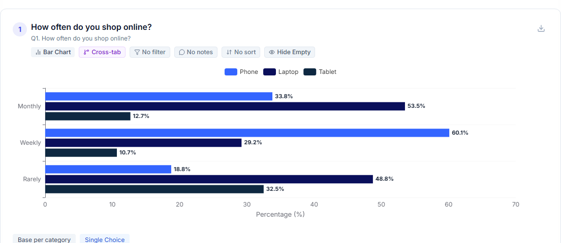
A cross-tab result - the overall number broken down by the segment that actually explains it.
Doing This in Opionate
Everything above is a manual exercise if you're working from a raw export - build a pivot table, filter it, rebuild it for the next segment you want to check. Reports does the same job as a direct part of building a dashboard: pick a question, break it down by another question or a respondent field, and the chart updates to show the segments side by side rather than a single blended bar. Because it's the same dashboard you're already using rather than a separate export step, checking a second or third breakdown - tier, then tenure, then both - takes seconds rather than a rebuild each time, which matters given how much of this guide is really about the discipline of checking more than one breakdown before trusting the first one you see.
For the deeper methodology behind this - including how to spot when a pattern is worth building a whole hypothesis around - see our full guide, Beyond Averages: The Professional's Guide to Survey Analysis.