
If you're staring at three logo directions trying to figure out which one to run with, you've got a single landing page redesign and need to know what's actually working before it ships, or you're rebuilding a navigation menu and want to know if it'll make sense to anyone but you - you're already in one of the situations this guide is written for.
If you have one design - a landing page, a packaging concept, an ad - and you need to know what's actually working and what isn't before it goes further, you're looking for deep-dive stimulus feedback: showing people the design and asking targeted questions about specific parts of it, rather than one blended "do you like it" reaction. This is the common starting point for a designer or marketer with a single concept to pressure-test, or a researcher after qualitative color on why something is or isn't landing.
If you have several options on the table - three logo directions, five packaging concepts, a handful of ad variations - and the real question is which one people actually prefer when forced to choose, you're looking for pairwise comparison: a head-to-head knockout that produces a ranked result instead of a pile of similar-looking ratings. This is the more common situation once a project has moved from "is this any good" to "which of these do we actually ship."
If your question isn't about a specific design at all but about how something is organized - which features belong under which menu, how content should be grouped, what a respondent expects to find where - you're in information-architecture territory, and the two methods built for it are complementary rather than competing. Card sorting tells you how people would organize things given a blank slate, useful early, before a structure exists yet. Tree testing tells you whether a structure you've already built is actually navigable, useful once you have a candidate structure and want to confirm real people can find their way through it. And if your question is narrower still - not "can people navigate this" but "where would someone's very first instinct take them on this specific screen" - that's first-click testing, the most granular of the methods covered here.
None of this requires picking exactly right on the first attempt. It's common for a single project to move through more than one of these in sequence - stimulus feedback to sharpen a shortlist, then pairwise comparison to force a final decision among the survivors, the same two-stage pattern covered in more depth in our packaging concept testing guide. What all of these situations share, underneath the different names, is that none of them are really asking for an opinion the way a rating scale does. They're asking for a behavior - which card someone grouped with which, which of two images they tapped without hesitating, whether they found the right destination in a structure or gave up and backtracked - and that distinction is worth understanding properly before getting into any single method's details, because it's the reason this guide can't just hand you one universal scorecard.
Table of Contents
- Why Visual Testing Methods Don't Share One Metric
- Measuring Concept and Design Feedback
- Measuring Pairwise Preference
- Measuring Card Sorting
- Measuring Tree Testing
- Measuring First-Click Testing
- Why You Can't Average Across Methods
- Quick Reference: Method, Metric, and Benchmark
- FAQ
Concept & Design Feedback
Open reaction and preference on a single stimulus shown alone.
Pairwise Preference
A win rate from head-to-head duels - a genuinely different metric shape.
Card Sorting
Agreement on groupings - how consistently items get placed together.
Tree Testing
Success rate and path directness through a navigation structure.
First-Click Testing
Where the first tap actually landed, relative to the intended target.
Why Visual Testing Methods Don't Share One Metric
It's tempting to want one clean number that summarizes "how did the test go," the same instinct that makes NPS so appealing for customer relationships. Visual testing resists that instinct structurally. A tree test is fundamentally a findability task - can someone locate the right thing - and its metrics are about success and efficiency. A pairwise comparison is fundamentally a forced preference - which of two things wins - and its metrics are about relative strength, not absolute quality. A card sort is fundamentally about shared mental models - do people group things the way you'd expect - and its metrics are about agreement and clustering. Trying to force any of these into "rate this 1 to 5" throws away the exact thing that makes the method worth running in the first place: the behavior itself, not a self-reported summary of it.
That's the framework the rest of this guide follows, method by method: deep-dive stimulus feedback measured through per-element sentiment and thematic frequency, pairwise comparison measured through win records and strength scores, card sorting measured through agreement and clustering, tree testing measured through success and directness, and first-click testing measured through click accuracy and time. Each one gets its own section below, covering where its metrics actually come from, what they're measuring underneath the surface, and what a good result looks like - so the framework holds regardless of which specific tool you happen to be running it in.
Measuring Concept and Design Feedback
The most common way anyone gets feedback on a single design - a landing page, a piece of packaging, an ad - is to show it to someone and ask what they think. The trouble is that "what do you think" about an entire design produces exactly the kind of vague answer that's hard to act on: "something feels off," with no way to tell whether the problem is the headline, the color, or the layout underneath it all.
The fix is simple: start with one open question about the whole design - "what's your first reaction to this?" - to catch an honest, unfiltered impression before anyone's attention gets pointed anywhere. Then, if you need to understand how a specific part is shaping that overall impression, follow up with a question aimed directly at it: point at the headline and ask if it's clear, point at the signup button and ask if it stands out, point at the hero image and ask what it communicates. Picture a marketer with one draft of a landing page and a launch date two weeks out - that's exactly the sequence they'd want: one honest gut-check first, then a handful of specific answers about the parts they're least sure of, rather than one vague "does this work?" that gets them a shrug.
When you look at the results, keep each part's answers separate rather than blending them together. Don't average the headline's score with the button's score - they were never measuring the same thing, so a blended number doesn't actually answer anything. And for open-ended comments about a specific part, don't read every single one as its own data point - look for the same specific comment repeating across several people instead. One person saying a color feels off is a passing opinion; twenty people saying it independently, without prompting each other, is a real finding worth acting on.
For example: a team testing a new pricing page highlights the headline, the price display, and the "Get Started" button separately. The headline scores well - most people call it clear. The price display gets mixed reactions, split roughly down the middle between "reasonable" and "confusing," not a clear enough signal to act on yet. But the open-ended comments on the button surface the same complaint from twelve different people: "I wasn't sure what happens when I click this."
That's three different signals, and the team treats each one differently rather than reacting to the page as a whole. The headline stays exactly as it is - it's already doing its job, and touching it would just be busywork. The price display goes into a second, more targeted round later, since "mixed reactions" isn't specific enough to fix yet on its own. The button gets rewritten immediately, from "Get Started" to "Start Your Free Trial," a label that actually says what happens next - and before it ships, the team runs a small follow-up test on just that one element to confirm the confusion is actually gone, rather than assuming the new wording fixed it.
If you want to know the research terms for this: the general practice of asking about a design part by part is what market researchers usually call concept testing, and the specific idea of opening with an unprompted first-reaction question comes from something UX researchers call the five-second test, built around three things they track - comprehension (do people understand what it's for), recall (what they remember afterward), and first impression (their unprompted emotional reaction). Opionate's Stimulus Section is one tool built to run this kind of test directly.
Measuring Pairwise Preference
Think about how a knockout sports tournament decides a champion - two teams play, one wins, the loser is out, and the winner moves on to face a new opponent, round after round, until only one team is left standing. Nobody hands a judge all sixteen teams at once and asks them to rank the whole field from memory; the tournament breaks that impossible judgment call down into a series of easy ones, each between exactly two competitors. Pairwise comparison applies that same idea to a set of images or design options instead of sports teams: two options at a time, a straightforward pick, the winner advancing to face a new challenger, repeated until one option has outlasted every other.
That's also why it tends to beat the more common alternative - showing five options at once and asking someone to pick a favorite. That's a much harder judgment call than it looks, the same way it's harder to pick your single favorite dish off a menu of ten than to just say which of two you'd rather order - holding five things in your head at once quietly rewards whichever one you happened to look at first, while a straight two-way choice never gives that bias anywhere to hide.
What you get back at the end is usually just the overall winner, and for most projects that's genuinely all you need. There's one situation worth watching for, though: if your images were split into separate brackets before a final round (some tools call this "Leagues" or "pools"), the raw win count can be misleading.
For example: a snack brand tests six packaging concepts split into two brackets of three. One bracket happens to hold three genuinely strong concepts from a professional design studio; the other holds three rough placeholders nobody expected to win. The strongest placeholder still ends up with a "2 wins" record after beating the other two weak options - identical on paper to the strongest concept from the tough bracket, even though the second one earned its wins against much stiffer competition. Judged on win count alone, the two finalists would look equally strong.
Rather than treat both as equally in the running, the team runs one more short round: the weak-bracket winner goes head-to-head against a strong-bracket concept that got eliminated early. It loses clearly. That confirms what the win count alone couldn't show - the real competition was always inside the strong bracket - and the team commits their print budget to that bracket's champion instead of splitting attention between two finalists that were never actually equal.
If you want to know the research behind that caution: statisticians have a formal way to correct for it, called the Bradley-Terry model (Bradley and Terry, 1952). Instead of just counting wins, it works out a "strength" score for every option based on the full pattern of who beat whom across the whole tournament, not just each finalist's own record - the same basic method used to rank chess players and sports teams, and, in a nice modern echo of the same idea, today's head-to-head AI chatbot leaderboards. You don't need to run this calculation yourself for most tests - the overall winner is still a fine answer on its own - it mainly matters when you're comparing across grouped brackets, or when you want a full ranking of every option rather than just the single winner. A simpler middle ground is win rate (wins divided by total matches played), which at least accounts for how many times each option competed, even without fully correcting for how strong those opponents were. See our guide to Pairwise Comparison testing for the mechanics of running this kind of tournament in Opionate.
Measuring Card Sorting
Card sorting asks respondents to organize a set of items - features, content topics, product categories - into groups that make sense to them, either by naming their own categories (open sort) or by placing items into categories you've already defined (closed sort). It's the classic method for figuring out whether the way you've organized something matches the way real people actually think about it - a team rebuilding a website's main navigation, or trying to figure out how customers naturally group thirty product types into a handful of category pages, would reach for this before ever sketching a menu. It's usually paired with tree testing as a two-step process: card sort first to find a structure that matches people's mental models, tree test second to confirm that structure is actually navigable.
There's no single "correct" way to sort in an open card sort, so what you're really measuring is agreement - how much people's groupings actually matched each other. A high level of agreement on a given group means you can be confident that grouping matches how people naturally think; if items ended up scattered all over the place with no real pattern, that's a sign your categories don't match anyone's mental model, and it's worth trying a different structure rather than picking one arbitrarily and hoping for the best.
For example: an app team tests how users would group twenty product features. Eighteen of twenty participants put "Export to PDF" and "Export to Excel" in the same group, regardless of what they called that group - a clear, reliable pair worth keeping together in the final menu. But "Notifications" ends up split almost evenly across three different groups, with no real agreement at all - a sign that feature needs a clearer home, or a clearer label, before it ships.
The team locks in the export pair right away - that level of agreement is a safe, confident decision, nothing more to test. Notifications is treated differently: rather than guess which of the three groupings to go with, they hold it out of the final menu for now and run a short follow-up test offering just two or three alternative placements for that one feature, checking which one people actually expect before locking in where it lives.
If you want to know how this typically gets shown to you: an Agreement Score gives you one number for how consistently people grouped things the same way. A grid or tree-style diagram (sometimes called a similarity matrix or a dendrogram) shows which specific items people almost always grouped together, even when they gave the group completely different names - useful for spotting a real cluster hiding behind inconsistent labels. And if you gave people predefined categories to sort into rather than a blank slate, a breakdown (sometimes called a standardization grid) shows whether any one category ended up soaking up far more items than you intended, or barely got used at all.
Measuring Tree Testing
Where card sorting asks people to build a structure, tree testing asks them to navigate one that already exists - a text-only, stripped-down version of a site or app's hierarchy, with images and styling removed entirely so the test measures the structure itself rather than the visual design layered on top of it. Respondents are given a task ("find where you'd go to update your billing information") and click through the hierarchy until they either land somewhere they believe is correct or give up. This is the natural next step once a proposed menu structure exists on paper but before any designer has spent time building it out visually - confirming the structure itself holds up is far cheaper to fix at this stage than after it's fully designed.
Two numbers matter most here. Success rate is simply the percentage of people who ended up in the right place - a solid result is generally 70-80%, and 80% or higher is considered a genuinely healthy structure that most people can navigate without real difficulty. Directness is a different, and just as important, number: whether the people who succeeded got there in one smooth path, or had to backtrack and try a wrong branch first - aim for 75% or higher here.
Read the two together, not separately. A decent success rate paired with poor directness usually means people eventually land on the right answer, but the path there is confusing - which points at one specific mislabeled branch to fix, not a structure that needs rebuilding from scratch. Beyond these two numbers, it's worth noting exactly which wrong branch people clicked into before correcting themselves - that turns "the structure scored 74%" into a specific, fixable note about which label is actually causing the confusion.
For example: a team tests a new support-site structure with the task "find out how to cancel your subscription." 78% of participants land on the right page - a solid success rate on its own. But directness comes in at only 40%: most of those successful participants first clicked into "Account Settings" before backtracking to find "Billing," where cancellation actually lives. The fix isn't a redesign of the whole structure - it's moving or relabeling one branch.
Instead of rebuilding the navigation from scratch, the team makes one targeted change: they add a visible "Cancel Subscription" link directly under Account Settings that points straight to the Billing page, so anyone who guesses wrong still lands in the right place immediately instead of backtracking. They rerun the same test with just that one change in place, and directness climbs from 40% to 81% - confirmation the fix actually worked before it goes live everywhere.
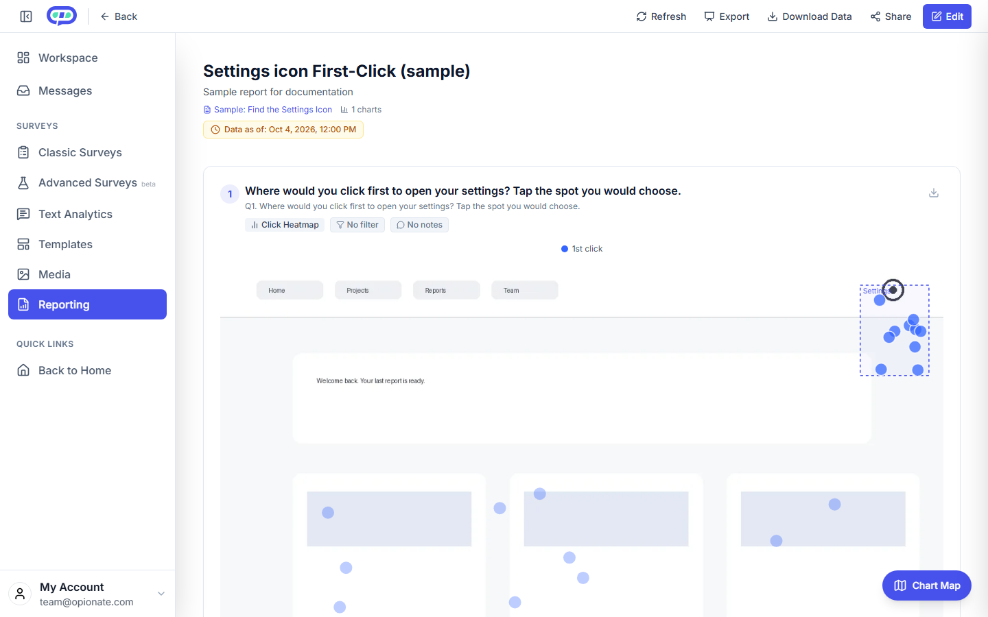
A click heatmap - first-click testing has its own metric shape, not shared with the other methods above.
Measuring First-Click Testing
First-click testing shows a real design - not a stripped-down structure - and asks where someone would click first to accomplish a specific task, recording exactly where they click before anything actually happens on screen. It's the right method for a narrow, concrete question, like whether people notice a redesigned checkout button or instinctively look in the right place for a newly relocated search bar, rather than whether an entire site structure holds together.
The one thing worth knowing above everything else: if someone's first click is wrong, the rest of the task usually goes wrong too. That makes first-click accuracy one of the earliest warning signs available in usability testing - published benchmarks treat 80% or higher as strong, 60-79% as a moderate concern worth a closer look, and anything below 60% as a sign the layout or labeling needs real rework before launch. It's also worth timing how long the first click took - a fast, confident wrong click and a slow, hesitant one point at different problems: the first suggests something genuinely misleading, the second suggests the options just aren't communicating clearly enough to act on quickly.
For example: a team redesigns a product page and wants to know if people notice the new "Add to Cart" button before anything else. In the test, 65% of participants click the button first - a moderate concern by the usual benchmark. Looking closer at the wrong clicks, most of them land on a nearby product image that people mistake for a clickable thumbnail gallery - a specific, fixable layout issue, not a problem with the button itself.
Since the button itself isn't the problem, the team leaves its size, color, and placement untouched. Instead, they remove the subtle border and hover effect that was making the product image look tappable, so it stops competing with the real button for attention. A quick retest on the revised page shows first-click accuracy climb to 84%, past the point of real concern - fixed without touching the one element that was already working.
If you want the research behind that: a widely cited 2006 study by Bob Bailey and Cari Wolfson found that a correct first click led to full task success 87% of the time, versus just 46% when the first click was wrong. More recent analysis of tree-testing data found a similar pattern, with a correct first click making someone roughly three times more likely to finish the task overall. That gap has held up across nearly two decades of research since.
Why You Can't Average Across Methods
Once you're running more than one of these methods on the same project, there's a real temptation to roll everything up into one blended "UX health score" - a tree test success rate, a pairwise win rate, and a card-sort agreement score, averaged together into a single number for a stakeholder deck. Resist it. A 78% tree-test success rate and a 78% card-sort agreement score are not the same kind of 78% - one is measuring whether people can find something in a structure that already exists, the other is measuring whether people's own mental models agree with each other before any structure has been imposed at all. Blending them obscures exactly the information that made each method worth running separately in the first place: which specific behavior, in which specific method, is actually the problem. Report each method's results in its own native terms, and use the FAQ and reference table below to help translate what a given number in a given method actually means, rather than trying to collapse them into a false common currency.
Quick Reference: Method, Metric, and Benchmark
| Method | Primary metric(s) | What a good result looks like |
|---|---|---|
| Stimulus-style deep-dive feedback | Per-element sentiment distribution, thematic frequency, first-impression comprehension/recall | No universal benchmark - directional and comparative across elements/concepts |
| Pairwise comparison | Tournament winner, win rate, Bradley-Terry strength score | No universal benchmark - relative ranking, not an absolute score |
| Card sorting | Agreement Score, Similarity Matrix, Dendrogram, Standardization Grid | Higher agreement = stronger consensus on structure; context-dependent |
| Tree testing | Success rate, Directness | 70-80%+ success is good, 80%+ is healthy; 75%+ directness is good |
| First-click / task-flow testing | First-click accuracy, time to first click | 80%+ accuracy is strong; 60-79% moderate concern; below 60% needs rework |
FAQ
Do these benchmarks depend on which specific tool I run the test in?
No - the metrics and benchmarks described here come from the broader UX research field, not from any single platform, so they apply regardless of which tool is actually running the test.
Do I need to calculate a Bradley-Terry score by hand for every pairwise test?
No - for most straightforward tournaments, especially a flat Randomization bracket, the tournament winner is a perfectly defensible answer on its own. Reach for a fuller ranking calculation specifically when you're using Leagues mode, or when you need a ranked order of every image rather than just the single winner.
Is a 70% tree-test success rate a failure?
Not necessarily - it's within the "generally good" range cited in UX benchmarks, though below the 80%+ mark considered a genuinely healthy tree. Look at it alongside directness before concluding anything: a moderate success rate with high directness suggests a smaller, more targeted labeling fix rather than a structural rebuild.
Why does a correct first click matter so much more than it seems like it should?
Because it's evidence of whether your information architecture and labeling matched the respondent's own mental model at the exact moment they had the least context - before they've had a chance to explore, backtrack, or self-correct. A wrong first click doesn't just cost time, it signals a mismatch that tends to compound through the rest of the task.
Should I run card sorting before or after tree testing?
Card sorting first, if you're starting from scratch or reworking a structure - it tells you how people would organize things given a blank slate. Tree testing second, once you have a candidate structure, to confirm real people can actually navigate the specific hierarchy you built from those results.
What's the single biggest mistake people make analyzing visual testing results?
Averaging or comparing scores across different methods as if they were on the same scale - covered in more depth above. Each method's numbers only mean something in the context of that method.
For the mechanics of building this kind of test in Opionate, see Design Feedback Surveys: Visual Concept Testing with the Stimulus Section and Pairwise Comparison Testing: Tournament-Style Preference Tests, both part of Visual Tests. For the broader methodology behind analyzing any survey or test result well, see Beyond Averages: The Professional's Guide to Survey Analysis.