
Reading Shelf Test Results: Picks, Share, and First-Pick Position
A Shelf Test report answers one question: which image caught people's eye? It gives you two readings of that answer, the picks themselves and how early people reached for each one. This guide explains both, and what neither one can tell you.
The Picks Chart and Gallery
The result appears as a bar chart with your images shown above it as a gallery of thumbnails. Each bar is one image, and each image's card carries its label, which you always see here whether or not labels were visible to respondents.
The bar counts the respondents whose final selection included that image. A respondent's final selection is what they had selected when they finished the section. An image picked, then deselected, and never picked again doesn't count for that respondent.
Read the bars as a share of respondents rather than as a ranking of quality. Two images can both be picked by a large share of people.
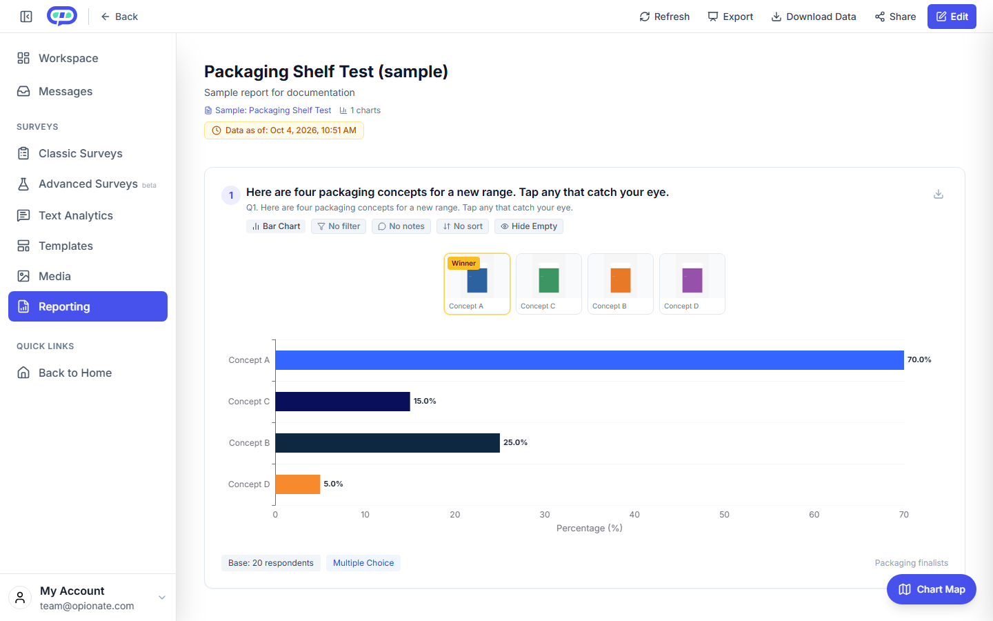
A sample report from 20 synthetic responses, not real research. The gallery shows each image with its label, and the bar chart shows the share of respondents who picked it.
First-Pick Position
The enlarged view of the gallery also shows an average for each image, labelled Avg. tap order and written as a number such as #3. This is the typical place in the respondent's sequence of taps where they first selected that image. A lower number means people reached for it earlier.
This matters because two images can end with similar picks and still tell different stories. An image people reach for early and often is standing out quickly. An image chosen later, after people have looked at the others, may still be a good option that takes a second look. The picks chart alone can't show that difference, and first-pick position can.
The position counts every tap and untap in the sequence, so it reflects the order people acted in, not a clock time. It appears only in the enlarged view, which is where you'd read it alongside the picks.
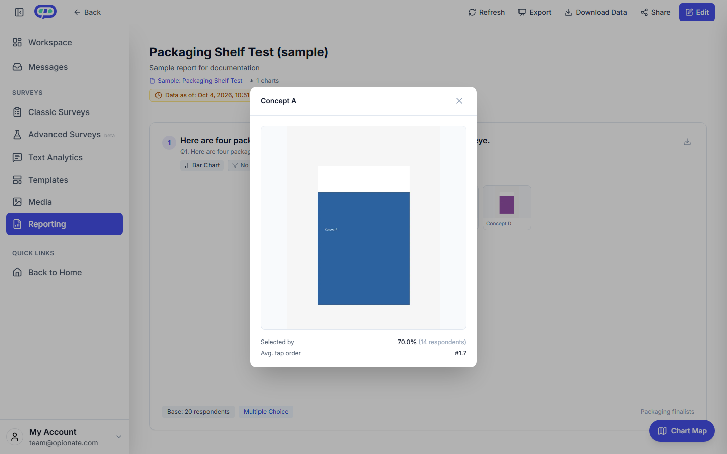
The enlarged view for one image: its share of picks and its average tap order, labelled "Avg. tap order". Sample data, not real research.
What Can Go Wrong When You Read It
Reading a small difference as a result. With a small sample, a few percentage points between two bars can be noise. Look at how many respondents are behind the chart before you decide anything.
Treating first-pick position as a quality score. An option can be picked late and still be the one people choose most. Use position to understand how an image competes for attention, not to rank designs.
Reading one respondent as the whole picture. The grid is shuffled for each respondent, so the report doesn't compare results by screen position. Read the bars and first-pick positions across the whole sample, not from any one respondent's sequence.
Expecting a reason. A Shelf Test shows what people noticed, not why. To learn the reason, add an open-ended question after the section and analyse it with Text Analytics.
A Practical Reading Order
- Check the number of respondents behind the chart.
- Read the picks chart to see which images got the largest share.
- Open the enlarged view and check first-pick position for the leading images.
- Look for disagreements, such as an image with a high share but a late first pick, and decide whether that changes your choice.
- Add the reason question if the choice still isn't clear.
For how the section is built, see How to Set Up a Shelf Test Section.