
How to Set Up a Shelf Test Section
A Shelf Test section needs three things: a pool of images, an intro message, and a rule for how many images a respondent may pick. This guide covers each one in the order you'll meet them in the builder.
The Anatomy
| Piece | What it controls | Who sets it |
|---|---|---|
| Image pool | The two to eight images shown together | Creator, picked from the Media Library |
| Image labels | Optional names for your own reference | Creator, per image |
| Intro message | The question respondents read before they start | Creator, the section's question text |
| Pick limits | The minimum and maximum a respondent may select | Creator, minimum and maximum |
| Show labels to respondents | Whether labels are visible on the grid | Creator, on or off, off by default |
Before You Start
You need an Advanced Survey. Shelf Test isn't available in a Classic Survey. Have your images ready in the Media Library, or be ready to upload them there. Each image should be a finished, comparable option, such as a finalist packaging design, an ad visual, or a product photo. Mixing finished and draft visuals in one pool makes the result hard to read.
Step 1: Add a Shelf Test Section
In the builder, add a new section and choose Shelf Test. The section appears in your survey with an empty image pool.
Step 2: Attach the Image Pool
Open the section's image pool and choose your images from the Media Library. You can attach between two and eight images. The builder shows how many you've added against the limit.
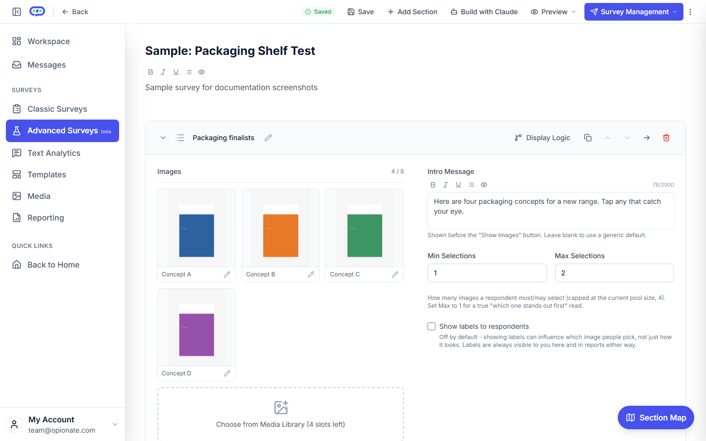
The builder with four sample images, a short intro message, selection limits of one to two, and labels hidden from respondents. The images and labels are sample content.
Each image can carry an optional label. Use labels for your own reference, such as "Concept B, matte finish", or leave them blank and the image's filename is used. Labels stay hidden from respondents unless you turn them on, covered in When to Show Labels in a Shelf Test.
Duplicating a section also copies its image pool. The copy uses the same images, but its labels are its own, so editing a label on one section doesn't change the other.
Step 3: Write the Intro Message
The question text of the section is the intro message respondents see before they start. It's also the question title in your report, so write it once and make it work for both. A useful pattern is a short instruction with the context:
"Here are six packaging options for the new range. Tap any that catch your eye."
Keep it neutral. Don't name a favourite, and don't ask people to judge the design, since the test is about what they notice.
Step 4: Set How Many Options a Respondent Can Pick
Set the minimum and maximum number of selections for the section.
- One pick (minimum 1, maximum 1): the strictest read, where a respondent must choose a single winner.
- A shortlist (for example, minimum 1, maximum 3): respondents keep several options that catch their eye, useful when you're narrowing a long list.
- No limit: leave the maximum empty if respondents can pick as many as they like.
A respondent can't tap past the maximum, and they can't continue until they've reached the minimum.
Step 5: Decide Whether Labels Are Visible
Leave Show labels to respondents off unless your comparison depends on names or prices. Turning labels on changes what people react to, so it's a deliberate choice rather than a setting to leave on.
Step 6: Preview and Publish
Preview the section as a respondent. Check that the grid reshuffles on each visit, that tapping an image selects it and tapping it again deselects it, and that the limits behave the way you set them. Then publish.
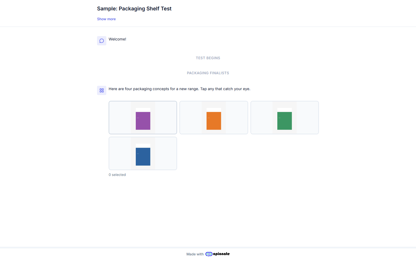
What a respondent sees before tapping: the intro message above a grid of sample images, with no labels. The images are sample content.
Publishing needs at least two images in the pool. A section with fewer can be saved as a draft but won't publish.
Common Setup Mistakes
- Too many similar images. If eight images look almost the same, respondents can't tell them apart and the picks spread thinly. Fewer, more distinct options usually give a clearer read.
- Labels left on by accident. A visible caption can turn "which one catches your eye" into "which name do you like."
- A leading intro message. "Which of these is the best design?" asks for a judgement, not an attention reaction.
- Limits that don't match the question. With no maximum on a "which one stands out first" question, people can pick everything. Set the limit to the decision you actually need to make.
FAQ
Can I use Shelf Test in a Classic Survey?
No. It's a section type for Advanced Surveys, and you can mix it with Plain Questions and the other section types in the same survey.
Can Claude build this section for me?
Yes. If you've connected Claude to Opionate, it can add a Shelf Test section to an Advanced Survey draft. See Drafting Surveys with Claude.
Once the section is live, see Reading Shelf Test Results for what comes back.