
NPS, CSAT, and CES earned their popularity honestly. Each one boils down to a single, simple question, which means they're fast to field, easy to drop into any survey without much design work, and - because so many companies use the same question worded the same way - easy to benchmark and trend over time in a way a custom-written satisfaction question never quite is. Net Promoter Score in particular has a specific, well-documented origin: Fred Reichheld introduced it at Bain & Company in a 2003 Harvard Business Review article called "The One Number You Need to Grow," built around a genuinely useful insight - that "how likely are you to recommend us" predicted business growth more reliably than the longer, more complicated satisfaction surveys companies were running at the time. It's a good idea, executed simply, and two decades of case studies have only reinforced why it stuck.
That same simplicity is exactly what makes it tempting to reach for NPS, or CSAT, or CES, as the default answer to almost any measurement question, regardless of field - a nonprofit measuring beneficiary impact, a university measuring student experience, a hospital measuring patient care, all reaching for a metric built specifically around a commercial buy-and-recommend relationship, because it's the one everyone already knows how to calculate. This undersells how much real, field-specific research already exists, built by people who spent years figuring out what actually predicts the outcome their field cares about. Employee engagement has Gallup's Q12, a fixed set of items validated across some of the largest workplace datasets ever assembled. Healthcare has CAHPS, a federally developed measurement program with real regulatory teeth. Higher education has NSSE, built around which student behaviors actually predict learning rather than which ones just feel good to report. Product teams have the Sean Ellis test and the System Usability Scale, both built to answer questions NPS was never designed to answer. This guide is a properly researched tour through what these fields actually measure - not just the name of each metric, but the actual questions inside them, how they're scored, real benchmark numbers where they exist, and why swapping in a generic metric instead of the one built for the job tends to produce a number that's easy to collect and hard to trust.
Table of Contents
- Employee and HR Metrics
- Market Research and Brand Metrics
- Product and SaaS Metrics
- Healthcare and Patient Experience Metrics
- Education Metrics
- Nonprofit and Social Impact Metrics
- Event Metrics
- Why Borrowing a Metric From Another Field Can Backfire
- Quick Reference: Metric, Field, and Benchmark
- FAQ
Employee & HR
Engagement, eNPS, and retention-focused metrics.
Market Research & Brand
Awareness, consideration, and brand health tracking.
Product & SaaS
NPS, CSAT, feature adoption, and churn-adjacent signals.
Healthcare
Patient experience and satisfaction, under its own real constraints.
Education
Student and instructor experience, course-level feedback.
Nonprofit & Social Impact
Outcome and impact metrics, not just satisfaction.
Events
Satisfaction and likelihood-to-return, measured right after the fact.
Employee and HR Metrics
Gallup's Q12 is the most rigorously validated instrument covered anywhere in this guide, and also the most tightly controlled - it's a fixed, licensed set of twelve items, and Gallup is explicit that the exact wording has to be preserved for the underlying validity research to actually apply; a paraphrased version isn't measuring the same thing the research validated, whatever it superficially resembles. Several of the items are widely and consistently cited across HR research and Gallup's own published material, giving a real sense of what the instrument actually asks: "I know what is expected of me at work," "I have the materials and equipment I need to do my work right," "At work, I have the opportunity to do what I do best every day," and "In the last seven days, I have received recognition or praise for doing good work." The remaining items in the set cover ground in the same spirit without a single fixed public wording - whether someone at work seems to care about the respondent as a person, whether someone has encouraged their development, whether their opinions seem to count, whether the mission or purpose of the company makes them feel their job is important, whether their coworkers are committed to doing quality work, whether they have a best friend at work, whether someone has talked to them about their progress in the last six months, and whether they've had opportunities in the past year to learn and grow. As a composite, the twelve items together have held up with a Cronbach's alpha of .91 at the business-unit level in Gallup's own meta-analyses - a strong reliability figure - linked across huge samples to profitability, productivity, safety incidents, turnover, and customer ratings.
Employee Net Promoter Score (eNPS) takes NPS's exact structure and points it inward, with a single question - "How likely are you to recommend [Company] as a place to work, on a scale of 0 to 10?" - scored the same way as commercial NPS: the percentage of 9s and 10s (promoters) minus the percentage of 0-through-6s (detractors), ignoring the 7s and 8s (passives) entirely. It functions as a much quicker, lower-effort pulse than a full Q12-style survey, at the real cost of the diagnostic depth a validated twelve-item instrument provides - eNPS tells you the temperature, not what's driving it. Real benchmark data exists here in a way it doesn't for most metrics in this guide: industry datasets put the overall average eNPS somewhere in the 12-14 range, with scores between 10 and 30 generally considered healthy, above 30 strong, and above 50 exceptional. Culture Amp's benchmark data from early 2026 breaks this down by sector - technology and healthcare both cluster around a median of 17, financial services and retail around 20, professional services around 21 - though every source publishing these numbers adds the same caveat: cross-company benchmarking is a rough guide at best, since scoring conventions and workforce composition vary enough between organizations that your own trend over time is a far more actionable signal than how you stack up against a published average.
Beyond these two, retention or intent-to-stay questions ask directly about someone's plans over the coming year - typically something like "How likely are you to be working here in 12 months?" - a more forward-looking signal than engagement scores alone, since it's entirely possible to be genuinely engaged in day-to-day work while quietly job-hunting for reasons the engagement survey never touched, like compensation or a return-to-office policy. And shorter pulse surveys, often just three or four questions pulled directly from a subset of the full Q12 themes and run weekly or monthly, trade the depth of an annual survey for the ability to catch a problem developing in real time rather than discovering it a year later in a report nobody can act on retroactively.
Market Research and Brand Metrics
Brand awareness gets measured two distinct ways in the same survey, using two structurally different questions, and the gap between the results is itself the finding. Unaided awareness is measured with an open-ended prompt and no options shown - "What brands of [category] can you think of?" - forcing genuine top-of-mind recall with zero help. Aided awareness follows with a list shown directly to the respondent - "Which of the following brands have you heard of?" - which reliably produces a higher number because recognition is a much lower bar than recall. A brand that scores high on aided awareness but low on unaided is known but not top-of-mind, a real marketing problem, but a completely different one than a brand nobody recognizes even when shown the name outright. Brand favorability - "How favorable is your overall opinion of [Brand]?" on a scale from very unfavorable to very favorable - and purchase intent - "How likely are you to purchase [Brand] the next time you buy [category]?" - go a step further than pure recognition, asking how someone actually feels and how likely they'd be to act on it, which functions as a closer leading indicator of future revenue than awareness on its own.
Brand lift studies, run around a specific campaign to measure whether it actually moved any of these numbers rather than assuming it did because the campaign ran, use a control-and-exposed design in practice rather than a single before-and-after survey. Kantar's approach, sometimes called "twinning," emails the same short battery of awareness, favorability, and intent questions to panelists who saw a given ad and to demographically matched panelists who didn't, then compares the two groups' answers to isolate the ad's actual effect from everything else happening in the market at the same time. Nielsen runs a similar control-versus-exposed methodology through its own consumer panels. The common thread across both: a brand lift number - typically reported as a percentage-point difference between exposed and control groups on each of the metrics above - is only meaningful relative to that comparison group, not as a standalone score the way an aided-awareness percentage can be read on its own.
Product and SaaS Metrics
The product-market fit survey, widely known as the Sean Ellis test, asks one question of active users - "How would you feel if you could no longer use this product?" - with exactly four answer choices: very disappointed, somewhat disappointed, not disappointed, and "I no longer use [product]." Ellis, a growth executive who worked on early growth at Dropbox, LogMeIn, and Eventbrite, built the test after noticing that companies which went on to grow successfully almost always had a meaningfully larger share of users pick "very disappointed" than companies that struggled to, and formalized 40% as the rough threshold separating the two groups. It's worth being precise about what the test was actually built for: a single-number diagnostic for a product that already has real, active users, not a tool for understanding why people would or wouldn't be disappointed, and not something that tells you what to build next - those questions need a follow-up, not a bigger sample of the same one.
Customer Effort Score has its roots in product and service contexts specifically, introduced by Matthew Dixon, Karen Freeman, and Nicholas Toman in a 2010 Harvard Business Review piece called "Stop Trying to Delight Your Customers," built on research across more than 75,000 customer interactions at the Corporate Executive Board (now part of Gartner). The standard question - "The company made it easy for me to handle my issue," rated from strongly disagree to strongly agree - was tested against several alternative phrasings in that original research and found to be roughly 25% more predictive of future loyalty than the next-best version, which is part of why this specific wording became the default rather than a looser "how much effort did that take" question. The underlying finding cuts against a lot of conventional service wisdom: companies don't get rewarded for exceeding expectations or delighting customers nearly as much as they get punished for making something effortful.
For usability specifically, the System Usability Scale (SUS), developed by John Brooke in 1996, is a fixed, ten-item questionnaire, and unlike Q12 it's fully public and freely reproduced in the usability literature. Respondents rate each of the following on a five-point scale from strongly disagree to strongly agree:
- I think I would like to use this system frequently.
- I found the system unnecessarily complex.
- I thought the system was easy to use.
- I think that I would need the support of a technical person to be able to use this system.
- I found the various functions in this system were well integrated.
- I thought there was too much inconsistency in this system.
- I would imagine that most people would learn to use this system quickly.
- I found the system very cumbersome to use.
- I felt very confident using the system.
- I needed to learn many things before going on with this system.
Odd-numbered items are positively worded and even-numbered items are negatively worded, deliberately alternating so respondents can't coast through the scale on autopilot without actually reading each statement. Scoring converts every item onto a common 0-4 direction (subtract 1 from the raw score on positive items, subtract the raw score from 5 on negative items), sums all ten, and multiplies by 2.5 to land on a final 0-100 scale. Jeff Sauro's meta-analysis of roughly 5,000 SUS scores across 500 separate studies put the average at 68 - a "C" grade, the 50th percentile, not a good score, just an average one. Scoring above roughly 80 puts a product in the top 10% of studied systems, which happens to be around the point where users become measurably more likely to actually recommend the product to someone else - a nice, independently-arrived-at echo of NPS-style loyalty from a completely different measurement tradition built decades apart. Beyond these three, a direct renewal or churn-risk intent question - how likely someone is to continue or cancel - gives an earlier warning than waiting for an actual cancellation to show up in billing data weeks or months later.
Healthcare and Patient Experience Metrics
Patient experience measurement is the most standardized field in this entire guide, for a straightforward reason: it's tied to money and regulation, not just best practice. The Agency for Healthcare Research and Quality (AHRQ) developed CAHPS - Consumer Assessment of Healthcare Providers and Systems - starting in 1995, specifically to create a national, standardized way to measure patient experience, and CMS now uses CAHPS scores to inform value-based reimbursement decisions and public-facing tools like Hospital Compare and the Hospital Star Ratings. That's a real financial incentive for standardization that most other fields in this guide simply don't have.
HCAHPS, the hospital version in use since 2006, is a genuinely large instrument once you look inside it: 29 questions total, of which 22 are publicly reported, rolled up into 10 measures - seven composite topics that each combine two or more related items, two individual items (cleanliness and quietness of the hospital environment), and one global item pair (an overall 0-to-10 hospital rating, plus a willingness-to-recommend question that's functionally the same NPS logic showing up inside a federally standardized instrument). One of the communication composites, for example, is built from questions like "During this hospital stay, how often did nurses treat you with courtesy and respect?" answered on a four-point frequency scale - never, sometimes, usually, always - rather than an agreement scale, which is a small but deliberate design choice: frequency questions ask what actually happened, agreement questions ask how someone feels about what happened, and CAHPS leans toward the former wherever the underlying event is genuinely countable. CG-CAHPS (Clinician & Group) applies the same logic to an individual provider and their practice rather than a hospital stay, and there are further dedicated versions for health plans, home- and community-based long-term services, and nursing homes, all covering broadly similar domains - accessibility, communication, care coordination, staff interactions - adapted to what's actually measurable in that specific care setting.
Adapted from the same effort-based logic behind Customer Effort Score, a Patient Effort Score asks something like "How easy or difficult was it to get the care you needed?" on a scale from very easy to very difficult, covering the practical friction points of getting an appointment, a referral, or a straight answer to a question. The premise translates cleanly from the commercial version: patients stay with practices that make care easy to access, independent of clinical quality, which makes friction itself a measurable, fixable variable rather than something that only shows up indirectly in no-show rates or complaints. Anywhere a result feeds into regulatory reporting, though, the validated CAHPS instruments are the standard - not an informally adapted recommend question, however well-intentioned.
Education Metrics
The National Survey of Student Engagement (NSSE), administered by Indiana University's Center for Postsecondary Research through an instrument called The College Student Report, run annually at hundreds of four-year colleges and universities, is built around a specific research premise: that certain behaviors - engaging with challenging coursework, collaborating with peers, interacting with faculty outside class, taking part in enriching experiences beyond the classroom - are empirically linked to outcomes an institution actually cares about, like persistence, satisfaction, and graduation, not just to whether students report feeling good about a semester. Results are organized under four broad themes - Academic Challenge, Learning with Peers, Experiences with Faculty, and Campus Environment - each broken down into more specific Engagement Indicators built from clusters of related survey items. Academic Challenge alone splits into four named indicators: Higher-Order Learning (how much coursework asks students to apply, analyze, and evaluate rather than just memorize), Reflective and Integrative Learning, Learning Strategies, and Quantitative Reasoning - a level of decomposition that lets an institution see, for instance, that students report plenty of academic challenge but very little collaborative learning, rather than one blended "engagement" number that hides which specific behavior is actually missing.
Course evaluations are the far more familiar instrument to anyone who's been through higher education, typically covering instructor clarity, fairness of grading, workload relative to expectations, and availability outside class - and they come with a genuinely important caveat worth knowing before leaning on them too heavily. A substantial body of research has found that student evaluations of teaching do not reliably correlate with actual learning. Multiple studies have found evaluation scores correlate more strongly with the grade a student received or expects to receive than with independently measured learning outcomes, and in at least one line of research, students who performed better in a follow-on course had been taught in the first course by instructors who received lower evaluation scores - the opposite direction you'd expect if evaluations were cleanly measuring teaching effectiveness. The likely explanation isn't that good teachers are somehow being penalized at random: a course that's appropriately difficult and demanding may produce more durable learning while scoring worse on a same-semester evaluation, precisely because effortful learning doesn't always feel pleasant while it's happening. None of this makes course evaluations worthless - they still capture real signal about clarity and workload - but it's worth treating a course evaluation score as one input rather than a proxy for teaching quality on its own. Learning outcome self-assessments, asking students to rate their own confidence in specific skills before and after a course, capture something different again - perceived growth, which doesn't always move in step with a grade or an evaluation score either.
Nonprofit and Social Impact Metrics
Donor retention is worth a precise clarification before anything else: it's not usually a survey question at all, it's a calculated metric pulled directly from giving records, which makes it different in kind from almost everything else in this guide. The standard formula is straightforward - the number of donors from the prior period who gave again in the current period, divided by the total number of donors in the prior period, times 100. If an organization had 500 donors last year and 300 of them gave again this year, that's a 60% retention rate. Real sector benchmarks make the number more useful in context: overall averages across benchmark studies land anywhere from the low 30s to mid-50s percent depending on methodology, with only around 14% of first-time donors going on to make a second gift at all - the single biggest leak in most donor pipelines. Recurring donors look completely different: retention rates in the high 70s to 80% range, with average tenure approaching eight years, which is exactly why so much of modern fundraising strategy has shifted toward converting one-time gifts into recurring ones rather than only chasing new donor acquisition. A nonprofit retaining only 30% of its donor file has to replace 70% of it every single year just to stay flat - a treadmill acquisition campaigns alone can rarely keep up with for long.
Where an actual survey question does come in is on the beneficiary side, and it's worth naming the adaptation explicitly rather than assuming the commercial NPS wording transfers as-is. Feedback Labs - whose member organizations include Ashoka, LIFT, and GlobalGiving - has documented years of work adapting NPS-style questions into forms like "How likely are you to recommend this program to someone in a similar situation to yours?" rather than the commercial "recommend to a friend or colleague" framing, which reads oddly when the person answering may be receiving a service out of need rather than choice. One specific, genuinely useful finding comes out of Keystone Accountability's work in Tanzania: a forced-choice, NPS-style question turned out to be a good way to counter courtesy bias - the well-documented tendency for beneficiaries of a program to inflate how positively they describe it, out of politeness or a reluctance to seem ungrateful toward an organization actively helping them. Program outcome measures - tracking something concrete like employment status months after a job-training program, or self-reported wellbeing after a community health intervention - vary enormously by program and are harder to standardize across the sector than donor or beneficiary satisfaction, but they're the piece that actually demonstrates impact rather than just activity.
Event Metrics
Events are worth calling out for a specific reason: benchmark NPS scores here run dramatically higher than in most B2B or consumer contexts - industry data puts the average event NPS around 53, using the standard "How likely are you to recommend this event to a colleague?" wording and the same 0-10 promoter/detractor scoring as commercial NPS, but landing at a score that would be considered exceptional almost anywhere else in this guide. That's largely self-selection: people who chose to attend an event already wanted to be there, unlike a broader customer base that includes plenty of people with no particular attachment to the relationship either way. Post-event satisfaction and the event NPS question form the core measurement, typically sent within 24 to 48 hours while the experience is still fresh - response rates in the 30-40% range are considered strong for B2B events, versus 15-25% for consumer ones, and a short survey (three to five questions, a mix of roughly 70% structured and 30% open-text) consistently outperforms a longer one on completion.
Session-level ratings - a simple "How would you rate this session?" on a 1-5 or 1-10 scale, repeated per session - layer on top of overall event satisfaction and let organizers see which specific parts of a multi-session event actually landed versus which ones dragged. Every source on this topic warns against rating every single session individually for a large conference, though, since that volume of repeated, similar questions is exactly what triggers survey fatigue and tanks response quality partway through. Speaker or presenter ratings, tracked separately from the event as a whole, build a real track record across events over time - a consistently well-rated speaker is a known, bankable asset for next year's programming, independent of how any single event they appeared in was received overall.
Why Borrowing a Metric From Another Field Can Backfire
It's tempting to reach for whichever metric is most familiar - usually NPS - and apply it everywhere regardless of field, simply because it's the one everyone already knows how to calculate. The research covered in this guide is a fairly direct argument against doing that by default. A metric built around commercial recommendation doesn't translate cleanly onto a relationship that was never commercial in the first place, which is exactly why Feedback Labs and similar organizations have spent real effort adapting the underlying idea - forced choice, tied to real behavior - rather than deploying the commercial question verbatim on a population it was never designed for.
The course-evaluation research covered above makes the same point from the opposite direction: an instrument that looks like it's measuring the thing you care about - "was this course good" standing in for "did students learn" - can drift so far from that goal that the two end up negatively correlated in some studies. Both cases share the same underlying lesson. Borrowing structure - the discipline of using the same validated, consistent instrument the same way over time, the same way Gallup insists on preserved wording for the Q12 or AHRQ maintains standardized domains across every CAHPS variant - travels well across fields. Borrowing the specific metric, wording and all, without checking whether it was ever built to measure the relationship you actually have, usually doesn't.
Quick Reference: Metric, Field, and Benchmark
| Field | Primary metric(s) | Core question or components | What makes a good score |
|---|---|---|---|
| Employee / HR | Gallup Q12, eNPS | Q12: 12 fixed items (licensed). eNPS: 1 recommend question, 0-10 | eNPS: 10-30 healthy, 30+ strong, 50+ exceptional (compare to your own trend) |
| Market research / brand | Aided/unaided awareness, favorability, purchase intent | Unaided: open recall. Aided: shown a list. Favorability/intent: single scaled questions | No universal benchmark - measured as lift versus a control group |
| Product / SaaS | Sean Ellis PMF test, CES, SUS | PMF: 1 question, 4 options. CES: 1 agreement statement. SUS: 10 fixed items | PMF: 40%+ "very disappointed." SUS: 68 average, 80+ is top 10% |
| Healthcare | CAHPS (HCAHPS, CG-CAHPS), Patient Effort Score | HCAHPS: 29 questions, 10 public measures (7 composites + 2 items + 1 global pair) | Varies by CAHPS survey type and CMS reporting period |
| Education | NSSE, course evaluations | NSSE: 10 Engagement Indicators under 4 themes. Course evals: institution-specific | NSSE reported by dimension; course evals read alongside other evidence |
| Nonprofit | Donor retention (calculated), beneficiary NPS-style feedback | Retention: repeat donors ÷ prior-year donors × 100. Beneficiary: adapted recommend question | Donor retention: sector average roughly 30-55%, recurring donors 78-80% |
| Events | Event NPS, session ratings | Standard NPS wording, 0-10, per event or per session | Event NPS averages notably higher (~53) than most B2B/consumer NPS |
FAQ
Should I always use the industry-standard metric for my field?
It's a strong starting point, but not a mandate - the value of a standardized metric comes from consistency and comparability over time, so if you adopt one, keep asking it the same way rather than customizing it project to project.
Is a SUS score of 68 good or bad?
Neither, really - it's the average across roughly 500 studies, which makes it a genuine midpoint, not a passing grade. Above 68 is above average; you'd need to be north of 80 to land in the top 10% of studied products.
Why is event NPS so much higher than NPS in other contexts?
Largely self-selection - people who chose to attend an event already wanted to be there, unlike a general customer base that includes plenty of people with no particular loyalty either way, which pulls typical NPS scores lower in most other settings.
Is donor retention really a survey metric, or something else?
Something else, technically - it's calculated from giving records, not asked in a survey. It's included here because it's the nonprofit sector's functional equivalent of customer retention, and because the beneficiary-facing metrics nonprofits do survey for sit right alongside it in most impact reporting.
Can I combine metrics from different domains in one survey?
Yes, if the survey genuinely spans both - just be clear about what each question is actually measuring rather than blending them into one ambiguous score.
Should I trust course evaluations at all, given the research on them?
They still capture real signal about clarity, pacing, and student experience - the issue is treating them as a clean proxy for learning or teaching quality on their own, rather than one input alongside other evidence.
What if my field doesn't have an established standard metric?
That's common outside heavily regulated or heavily studied fields. In that case, the general customer-experience metrics - NPS, CSAT, CES, covered in our guide to common survey metrics - are a reasonable, well-tested starting point, adapted to your specific relationship rather than adopted wholesale.
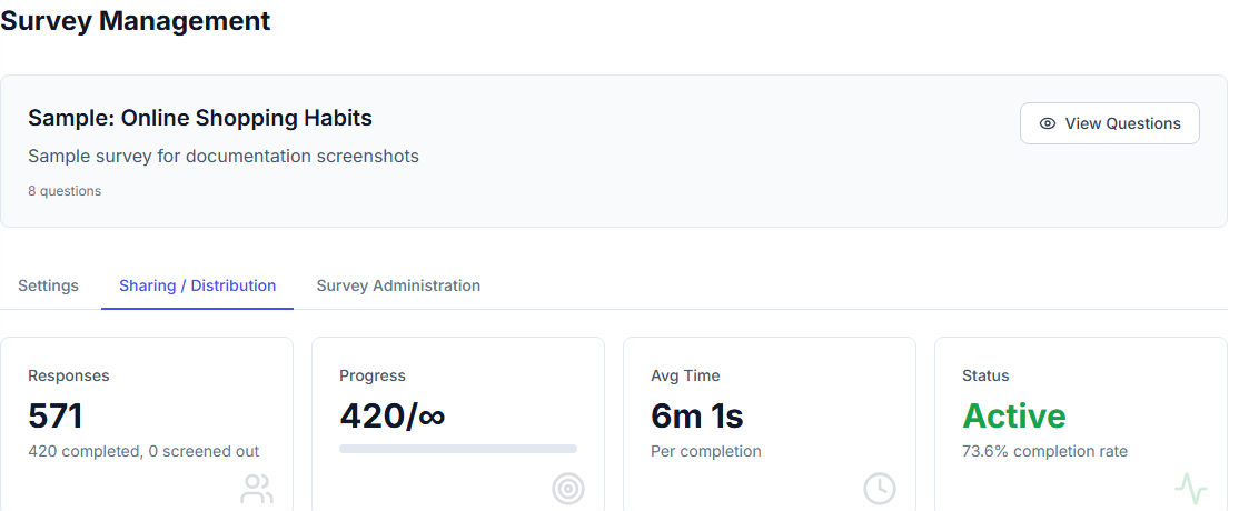
Completion statistics for a survey - a starting point regardless of which industry's metrics apply on top.
Doing This in Opionate
Whatever domain a metric comes from, it's built from the same handful of question types under the hood - a rating scale, a single-choice pick, an open-ended follow-up - all standard options in Survey Builder regardless of whether you're running an eNPS pulse, a CAHPS-style patient experience check, or a ten-item SUS questionnaire. Once responses come in, the same tools apply across domains too: Reports cross-tabs any of these scores by segment the same way whether you're breaking down patient experience by department or eNPS by team, and Text Analytics turns an open-ended "why" behind any of these metrics into counted, reportable themes rather than a pile of unread comments - the domain changes what you're asking about, not how you analyze what comes back.
For the general-purpose customer-experience metrics this guide deliberately sits alongside, see Common Survey Metrics and When to Use Each, and for the deeper methodology behind analyzing any of these well, see Beyond Averages: The Professional's Guide to Survey Analysis.